


 Collections
 Poker1 library
 Entry #6 (2010-04-09)
If you’re a graphics artist dropping in for the first time, you probably just muttered, “Holy shit!” I feel your pain. You’re looking at my response to modern web design theory. The new Poker1 look and feel is now complete. And it’s precisely how I want it to be.
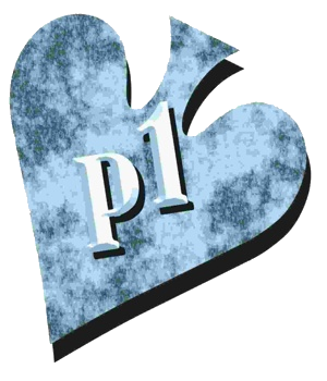
In a minute, we’ll compare the old Poker1 header, which made its exit late yesterday, to the new one. This long-planned change represents the final pre-launch update to the basic Poker1 appearance. As I explained in my first blog entry on March 18, I’m stubborn. I’m rebuilding the new Poker1 the way I want it to look, and the gray-scale graphics are here to stay.
“…a quiet rest stop along an Internet highway of glitzy billboards and colliding colors”
A comparison
Below, the old header is on top, followed by the new one. Obviously you can also see the new header full-size by just glancing (or scrolling) up.


Last night, the look-and-feel transformation was completed with this final changeover to the new header. I designed it to live in harmony with the default content graphic (the upside down spade you see near the top of almost every entry, including this one).
You might have wondered why the Poker1.com logo, previously at the top left of every page, and the content graphic were so different. If you’ve been following the “to-do list” and “log of changes,” two internal development resources that I made public so you can follow our progress and setbacks, you were expecting this to happen any day. You knew the old header logo, borrowed from the previous Poker1.com, was on its way out. (If you don’t have the slightest clue what I’m talking about, you can access the to-do list and the changelog from the home page.)
A quiet rest stop
Oddly, I know exactly what the majority of graphics artists preach as gospel; I just don’t share their passion. I hope the new Poker1 will appear as a quiet rest stop along an Internet highway of glitzy billboards and colliding colors. Sure, there will be plenty of color here, from photos to video. But that will take center stage. The surroundings, what you see right now, are designed to be friendly and functional. Simplified organization and easy-to-read-and-view content were key design considerations.
To any offended design professionals: It’s not that I don’t understand where the well-schooled graphics herd is heading; it’s that I’m heading somewhere else.
This is my home, and my visitors are my guests, my extended family. I don’t want to use graphic devices to shout at them. But I realize you’re upset, and I’m signing up for sensitivity training later today. — MC