NOTE: There is currently a NEW poll on the right sidebar that you can visit to choose your colors. (The results of the previous poll that didn’t include this blue-shades option are below.)
You can also vote or view results right here:
Which colors are best? (See choices above)
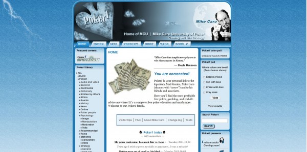
Shades of blue (42%, 33 Votes)
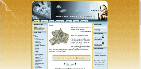
Tan with blue (28%, 22 Votes)
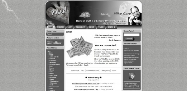
Gray scale (15%, 12 Votes)
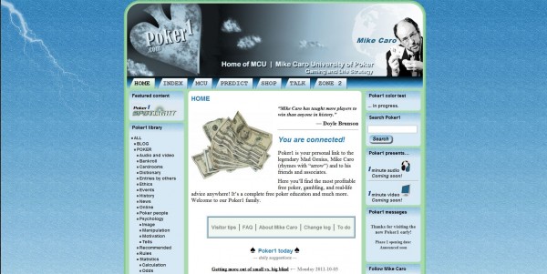
Green with blue (14%, 11 Votes)
Total voters: 78
Loading ...
After you’ve made a choice,
you will only see the results
and won’t be able to vote again.
Note:
During polling, surrounding colors will change periodically.
You can see all four choices under consideration below.
Which one?
We will open with one of these four choices. Please let me know which you prefer by leaving a comment below or by voting in the poll on the right sidebar. Thanks! — MC
Results of previous poll (without lastest blue-tone choice included):
Tan and blue 34
green and blue 33
gray scale 14
Additionally, over 100 opinions were provided on Facebook, by e-mail (use poker1@caro.com), and in comments below various Poker1 entries.
Above is image of the "shades of blue" choiceAbove is image of the "tan with blue" choiceAbove is image of the "green with blue" choiceAbove is image of the "gray scale" choice
Known as the “Mad Genius of Poker,” Mike Caro is generally regarded as today's foremost authority on poker strategy, psychology, and statistics. He is the founder of Mike Caro University of Poker, Gaming, and Life Strategy (MCU). See full bio → HERE.
Tan with blue, definitely. It looks much more dignified. Too much blue on the blue on blue. Need to keep it very professional and let the content do the talking :)
I made the decision when this new Poker1 was launched for beta testing that flashy color wouldn’t be appropriate. My plan is to let the content take center stage.
Having a large number of colors isn’t in keeping with that vision, although I’ve seen many quality sites with color splashing everywhere. I like those, too — depending on the purpose.
I want Poker1 to remain a quiet rest stop for learning, research, entertainment, and more. There will be plenty of color, but it will thrive in photos, illustrations, videos, and wherever it’s needed. We want to keep the surroundings relaxing.
 Entry #24 (2011-10-03)
Loading ...
Collections
Poker1 everything
Poker1 library


Tan with blue, definitely. It looks much more dignified. Too much blue on the blue on blue. Need to keep it very professional and let the content do the talking :)
Why is there not a full color choice in the poll?
Hi, JasperBob —
I made the decision when this new Poker1 was launched for beta testing that flashy color wouldn’t be appropriate. My plan is to let the content take center stage.
Having a large number of colors isn’t in keeping with that vision, although I’ve seen many quality sites with color splashing everywhere. I like those, too — depending on the purpose.
I want Poker1 to remain a quiet rest stop for learning, research, entertainment, and more. There will be plenty of color, but it will thrive in photos, illustrations, videos, and wherever it’s needed. We want to keep the surroundings relaxing.
Thanks for leaving a comment.
Straight Flushes,
Mike Caro