

 Collections
 Poker1 library
- By Mike Caro | Exit
 Entry #22 (2011-09-20)
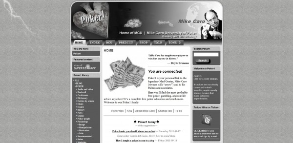
Do you like soft color or black and white? Please comment below.
What you see surrounding you today represents a test of color at Poker1.com. Poker1 is still in development, with a formal opening planned for the near future.
We have previously presented a gray-scale theme, only using color for some graphics, photos, and video. That tended to make P1 stand out in the crowd, in our minds, and made the site relaxing and quiet.
Your opinion
However, there are advantages to color, too, so we’re experimenting with this — hopefully non-distracting — two-tone theme. What do you think?
Do you like black and white better? This color test better? Both about the same? Neither?
If you’d like to weigh in, leave a comment below the photo of our traditional gray-scale theme that follows. — MC